Showing posts with label Thonik’s Design. Show all posts

Thursday, May 29, 2008

Shanghai Art Museum: Power-Thonik's Design


I was pleasantly surprised with the exhibition at the Shanghai Art Museum. It had work that was well done and displayed well and there was definitely thought put behind it. I can't say that it entirely felt coherent throughout the whole piece and that I came away with a message after it, but I was definitely impressed by what I saw and individually the works were well done - they all did share the common theme of appearing modern though. I did like the short video about the advertisement that had been created against a health care issue in the Netherlands and how that effectively reversed the policy. I also liked the portraits that were created using the other faces of individuals, I tried to notice a pattern there and it seemed that most of the faces used to create a portrait were from the photo directly to the left or right of the one it was creating but that only held true for most of the faces, not all of them on the picture (I hope that makes sense :P)


The carpets were neat, and like I said I was generally impressed by the works - but I didn't seem to get a overarching theme or really a lot of the purpose behind creating the works themselves - but then again maybe that's my own fault for not thinking about them long enough.
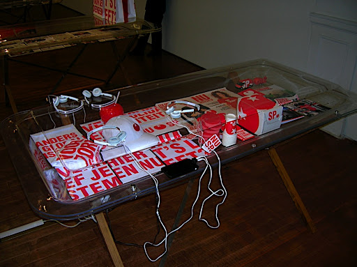

For this little area there was an iPod Touch look-a-like that would play a short video that composed mostly of sounds that were universal so it was easy to understand. But I didn't really get the point, maybe that's the running theme =P (Maybe I'm getting too used to looking for one certain type of influence in a work).

More pictures can be found at: http://picasaweb.google.com/mnolin/NYUInShanghaiShanghaiArtMuseum

Wednesday, May 28, 2008

Power Thonik’s Design


This time went to the Shanghai Art Museum, it was more interesting since there were 3 worth seeing exhibitions.

Thonik’s Design really attracted our eyes. I found three pieces especially attractive. One is the portraits of the leaders all over the world both past and now. Seeing from the distance it looks like sketch, but closer, you can find the hiding secret. Each of the giant person is composed of the big figure from other countries. I do not know if there is any special range among those pictures with regard to the political reason or just put them automatically. It made me think of a similar piece in the 2006 Biennale. It is a series of the logos of big brands in the world. Surprisingly , for each company, their original logo design was recreated and made by that of their rival company. Such as Adidas vs Nike, Mcdonald’s with KFC, Coca cola vs Pepsi etc. Many people appreciated these creations at that time. From my point of view , it represents the fact that the integration of various cultures , values and competition are inevitable. It is common for us to find similar element . And ,for these series of the portraits, it arose a question also, that is , if we can totally be independent in facing with other countries since we always hear different voices. To be harmonious or to be opposite, this is a question both to individual and to the country no matter if it concerns about political issues or not .

Second is a piece “untitled”, which is made by chocolate and put on the wall. The moment I got close, I found the atmosphere there is amazing, which arose my appetite. And the scene it depicted was two people enjoying the eating ,so it just put more imagination to the work itself. Lots of designers are always looking for some more expressive ways to arouse the audiences’ excitement or other physical resonance. It is not bad to use chocolate to awake our sense of taste. Though we can also find similar creation relevant to the chocolate in other design field, such like dress design and cuisine design etc, the wall picture is still a good idea since it brings us more imagination.

Third piece is an installation like the suspension bridge with balloons to support it on both sides. The artist developed the idea of freedom since the suspension bridge no longer relies on the physical condition and exists independently. Meanwhile , the function of the balloons and the bridge changes also, which lead us to think more about the concept “passing through”and “moving”.

Finally , I just mention a little about the carpet in the exhibition hall. I like them but I am a bit lost in the comment of the curator. Personally, I just think more about the alphabet design in these works. I though most of the works were done because of the various changeable form of the alphabet or the combination form of the words. I just wonder how we Chinese can do to make our characters also multivariant and easily understood.